Theme settings explained
Theme settings are global defaults for the downloaded or published theme. They affect how templates and sections behave across the site, instead of changing only one selected section or block.
Use Theme settings for site-wide decisions such as post list defaults, typography, color mode, content width, lightbox behavior, and media features. Some options also add feature-specific CSS or JavaScript to the theme build. After changing them, download a new ZIP or publish again so Ghost receives the updated theme.
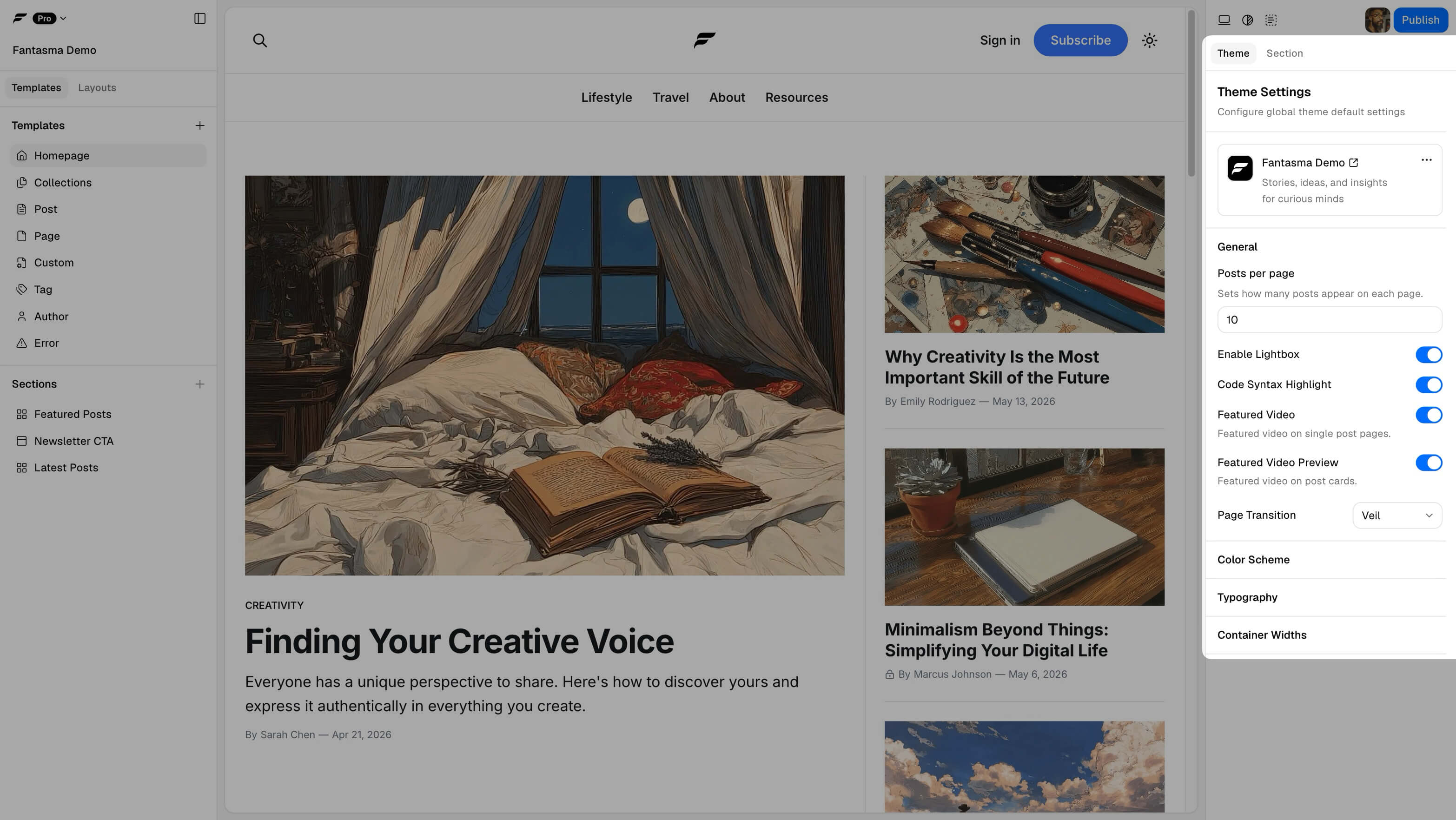
General
- Posts per page: How many posts load per paginated list when sections use the Routes source (see Post list filters).
- Enable Lightbox: Image and gallery lightbox behavior for images inside post and page content on the live site. Enabling it includes the lightbox assets the theme needs. An image block sets its own behavior through Click behavior, so a block can open the lightbox even with this switch off. The theme then ships the lightbox assets for that block alone, and content images stay unaffected.
- Code syntax highlight: Styling for fenced code blocks. Enabling it includes the syntax-highlighting assets the theme needs.
- Featured Video / Featured Video Preview: Pro options for working with internal tags for video heroes and cards. Enabling video features includes the theme assets needed for that behavior. See Video as featured.
- Page Transition: A Pro option for adding a global transition effect between page navigations. Setting it to None omits the page transition CSS from the theme.
Color scheme
Color mode: Light, Dark, and System set the theme's default appearance. System follows the visitor's operating-system preference and is Pro-gated on Free accounts.
Global palette: Pick a built-in neutral or themed scheme, or a custom scheme you created (Pro). Neutral schemes use your preview accent; themed schemes use fixed accent colors in the palette.
Hide built-in schemes: Open a built-in scheme's menu and choose Hide to remove it from pickers. If the scheme is already in use, Fantasma confirms before hiding; existing section references keep working.
Custom schemes: Create up to 12 named palettes with separate light and dark token sets.
Sections set to Default inherit the global palette and color mode. Override a single section from its color-scheme setting when needed.
For preview toolbar controls and visitor dark mode toggles, see Color & dark mode.
Fonts
Font pairings become the heading, body, and monospace stacks in the downloaded or published theme. Pick one of the built-in pairings, or build your own from any family in the Google Fonts catalogue. A project can hold up to 12 custom pairings.
Pro also lets a project own its fonts. Add a family from the catalogue and pick which weights
and styles you want, or upload your own .otf, .ttf, .woff or .woff2 files and name the
family yourself. A project can hold eight families, and one family up to 22 weights and styles.
Each uploaded file is capped at 5 MB, and a project's font files at 20 MB in total.
Bundle fonts in theme is on by default on Pro. It writes every font your pairing needs into
the theme under assets/fonts/, so the published site loads them from your own Ghost server and
never requests anything from Google. This covers the built-in pairings too. A family you never
added is added to the project the first time you download or publish, which needs the project to
be saved and counts towards your eight families. Turn it off to go back to loading fonts from
Google's CDN.
Container widths
Wide, Standard, Narrow, and Full max widths drive layout utilities in the theme.